Get free tips and resources right in your inbox, along with 60,000+ others
Follow Us
How to use the Pro Lightbox
The Pro Lightbox is a premium lightbox effect that displays your images full screen on home computers and mobile devices. Within this lightbox, you can comment on images and share them on popular social websites.
How to enable the Pro Lightbox
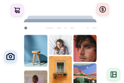
If you have purchased and installed NextGEN Pro, go to NextGEN Gallery > Other Options > Lightbox Effects, select NextGEN PRO Lightbox, and then save the changes.
image 1
For information about how the option “What must the lightbox be applied to?” works, then you can check out this guide.
Pro Lightbox effect settings
Color Options
Color Themes
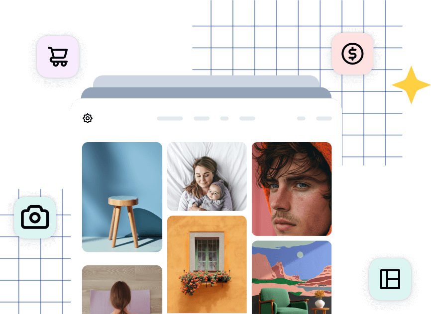
You can choose between three different color themes for our Pro Lightbox Effect. Find the option under Gallery > Other Options > Lightbox Effects > Color Options > Color theme.
image
Default: a dark theme.
All white: A white-based theme.
All black: Removes borders from the comments panel.
Custom Colors
You can also adjust individually some of the Lightbox areas.
Background Color
Sidebar background color
Sidebar button text color
Sidebar button background
Carousel background color
Carousel text color
Floating elements color
Icon color
Display carousel icons: By default it us set up to “No”, but if you change that setting to “Yes”, you can adjust the background of the icons. You can also make them look round like the screenshot above.
Lightbox and Image Sizing
Lightroom padding: Increase the padding around the Lightbox Effect. By default it is set to 0px. In this example, we set the padding to 15 px.
Crop Image Display: There are multiple options in this setting:
Images will be scaled to fill the display, centered and cropped
Images will be scaled down until the entire image fits (default)
Images will scale to fill the height of the display
Images will scale to fill the width of the display
Landscape images will fill the display, but scale portraits to fit
Pan Cropped images: When enabled images can be panned with the mouse. That sometimes is only visible if you adjust the Crop Image Display setting.
Social
Enable Comments: When it is set to “Yes”, the lightbox effect will display the comment icon. Once you click on that icon it will display a comment area on the sidebar.
Display comments initially: When on the commenting sidebar will be opened at startup
Enable sharing: When enabled social-media sharing icons will be displayed
Facebook App ID: Please leave it blank – this method is deprecated by now
Enable Twitter Cards: A Twitter’s username is required for Twitter Card analytics.
Thumbnail Carousel
Display carousel initially: When disabled the navigation carousel will be docked and hidden off screen at startup
Display Captions initially: When on the captions toolbar will be opened at startup
Display carousel thumbnails: Large galleries can impact performance on mobile devices, you can disable those thumbnails to reduce page load times.
Always display thumbnails
Never display thumbnails
Only on desktop browsers.Note: regardless of those settings the plugin hides the carousel if it isn’t wide enough to display at minimum three images. That prevents display on most cell phones in portrait mode but thumbnails should be visible in landscape and tablets if you use the option “Always display the carousel”
Ecommerce
Display cart initially: When on the cart sidebar will open at startup. If the “Display Comments” option is also on the comments panel will open instead
Transition Effects
Transition effect: You can choose between these options:
Crossfade between images
Slides the images depending on image position
Quickly removes the image background color, then fades the next image
Slides the images depending on image position
Fade between images and slide slightly at the same time
Transition speed: Measured in seconds
Slideshow speed: Measured in seconds
Pause on interaction: When enabled, the image display will be paused if the user presses a thumbnail or any navigational link
Other Settings
Enable browser routing: It is necessary for commenting to be enabled.
Router slug: Used to route JS actions to the URL. You can define your own slug, but by default, it’s set to gallery.
Localize limit: For performance, gallery images are localized as javascript, this limit will make an AJAX call to load the rest at startup. Set to 0 to include every image in displayed galleries (by default is set to 100).


