In branding, every detail matters, especially for designers, photographers, and artists who rely on solid visuals to connect with their audience. However, the role of typography and color theory in effective branding is much more than choosing a pretty font or hue.
My understanding of color first began to change when I decided to take up Studio Art as a second major in college. From there, I gravitated towards graphic design, which led me down a whole nother rabbit hole. Finally, I landed in the marketing world, where I really started to understand the importance of color psychology and branding.
Color and typeface are some of the most impactful elements in branding. Using these elements strategically allows you to convey personality and evoke specific emotions.
In this article, we’ll delve into the psychology behind colors, the nuances of font choices, and how these elements influence consumer behavior. No matter what stage you’re at in building a business, understanding these principles will help you improve your online presence and create a more memorable brand.
The Role of Colors in Branding
To apply colors effectively, you should first know the basics of color theory, such as the color wheel and complementary, analogous, and triadic color schemes. Don’t know what those mean? Start with our Beginner’s Guide to Color Theory for Photography and Design.
From there, each color has emotional connotations. For instance, blue is often associated with trust and calm, making it a popular choice for brands looking to convey reliability.
The Psychology of Colors
Here’s an overview of the meaning behind each primary and secondary color:
Primary Colors
- Red: Red is often associated with strong emotions like love, passion, and urgency. It can create a sense of excitement and energy but can also be perceived as aggressive or warning. Brands use red to grab attention, encourage quick decision-making, or evoke feelings of warmth and boldness.
- Blue: Blue represents calmness, trust, and stability. It’s often used by businesses to convey reliability and professionalism. Blue is also linked with tranquility and serenity, making it a popular choice for brands that want to promote feelings of safety and dependability.
- Yellow: Yellow is associated with happiness, optimism, and friendliness. It captures attention and stimulates mental processes, often evoking feelings of cheerfulness and warmth. Brands frequently use yellow to convey a fun, approachable, and upbeat personality. However, it can be overpowering if used excessively and may signal caution in specific contexts.
Secondary Colors
- Green: Green symbolizes growth, harmony, and freshness. It’s strongly associated with nature, health, and tranquility. It can also represent wealth and stability. Brands in the wellness sector often use green to communicate environmental friendliness, sustainability, or a sense of balance and calm.
- Orange: Orange combines the energy of red and the cheerfulness of yellow. It’s often associated with enthusiasm, creativity, and adventure. Orange is a friendly and inviting color that evokes excitement and confidence. Brands use orange to stand out and create a sense of fun or encourage a call to action.
- Purple: Purple is linked with luxury, royalty, and wisdom. It combines the calm stability of blue and the fierce energy of red. Purple is often associated with creativity, mystery, and spirituality. Frequently, brands that want to convey a sense of sophistication or evoke a feeling of prestige use purple in their branding.
Aside from these main ones, colors in branding psychology can get much more specific. Check out this extensive branding color chart by graphic designer Carey Jolliffe.
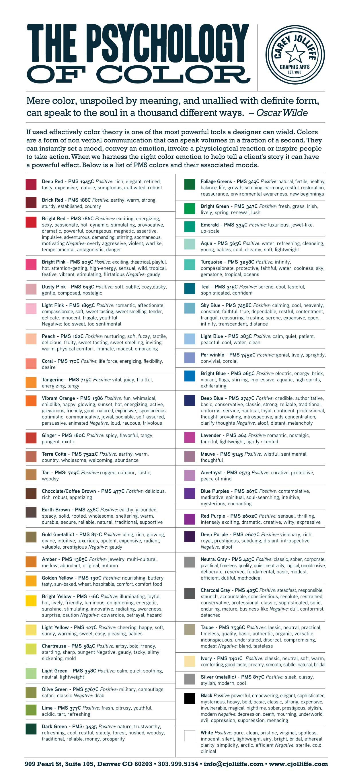
When selecting a color palette, it’s essential to consider how these colors align with your brand values and the emotions you want to evoke.
How Colors Affect Consumer Behavior
Aside from the general emotions conveyed, colors can affect purchasing behavior. For example, red raises the heart rate, increases appetite, and attracts impulse buyers, which is why fast food brands often use it.
On the other hand, green is the easiest color for the eyes to process and attracts shoppers on a budget, which is why it’s often used in large department stores. The following infographic from Neil Patel shares some of those details.

How Culture Affects the Meaning of Colors
Colors can have different meanings across cultures and religions. What works for a brand in one region might resonate differently elsewhere. For example, in Far Eastern culture, red can symbolize prosperity and vitality. However, in Middle Eastern culture, red may send signals of evil and danger.
Similarly, yellow may be associated with corruption in Christianity, while it signifies freedom and stability in Buddhism. The following Infographic from Top Web Design Schools shows how colors are dependent on location and religion.

Tips for Using Color Theory in Branding
As you can see, there’s much to consider regarding your brand colors. However, a thoughtfully chosen color palette can enhance your brand’s identity, making it more recognizable and memorable.
- Know Your Audience: Different colors appeal to different demographics. Understand your audience’s preferences and cultural perceptions of color.
- Create a Cohesive Palette: Choose a primary color representing your brand’s core message, then select a harmonious color scheme to support it.
- Test and Iterate: A/B test different color schemes to see which resonates most with your audience. Remember, what works for one brand might not work for another.
- Create a Color Branding Chart: Ensure your colors are used consistently across all marketing materials by creating a chart that includes your primary, secondary, and neutral colors along with their HEX, RGB, and CMYK values to maintain color consistency across different platforms.
By integrating these principles, you can create a powerful brand identity that stands out in the market and connects with your audience on a deeper level. Next, we’ll explore how typography complements color choices to further strengthen your brand identity.
The Role of Typography in Branding
Just as color plays a vital role in brand identity, typography is equally crucial in conveying a brand’s message. Typography and branding go hand in hand. The right typeface can communicate professionalism, creativity, or trustworthiness, while the wrong choice might dilute your message and confuse your audience.
The Psychology of Typography
Just like colors, typography affects how people perceive your brand. For example:
- Bold, Strong Fonts: Connote strength and stability, often used in the finance or automotive industries.
- Script or Handwritten Fonts: Conveys elegance or creativity, popular with luxury or artistic brands.
- Minimalist, Clean Fonts: Suggest modernity and innovation, commonly used by tech companies.
Check out this infographic from Prologic Technologies to see what different fonts convey.
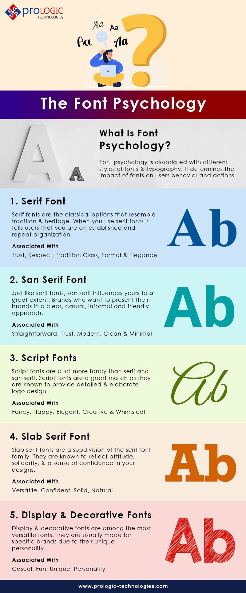
Typography helps set the tone for your brand’s communication, helping create a distinct brand voice that resonates with your audience.
Tips for Using Typography in Branding
- Know Your Brand Voice: Determine whether your voice is casual, formal, playful, or authoritative. Your font choices should reflect this voice. A formal wedding photographer may opt for a classic serif font, while a product photographer might choose a sleek sans-serif.
- Create a Typography Hierarchy: Use different font sizes and weights for headings, subheadings, and body text to guide the reader’s attention and create a structured, organized look.
- Consider Pairing: Combine fonts (such as a serif with a sans-serif) to create contrast and visual interest without overwhelming the design.
- Ensure Readability: While aesthetics are important, legibility is crucial. Make sure your text is easy to read across all devices and platforms.
- Maintain Consistency: Use consistent typography across all platforms and materials to build recognition and trust.
By leveraging typography effectively, you can strengthen your brand’s visual identity and enhance the overall user experience.
Combining Typography and Color for a Strong Brand Identity
The combination of color and typography can significantly impact how your brand is perceived. When used together, these elements can capture your brand’s essence.
- Match Colors with Fonts: Pair colors and fonts that complement each other. For example, a bold color might work well with a clean, minimalist font to create a balanced look.
- Prioritize Simplicity: Avoid overly complex designs that can distract from your message. Keep your typography and color choices straightforward.
- Stay True to Your Brand: Choose fonts and colors that align with your brand values and target audience. Be open to updates and changes based on feedback and market trends.
- Develop a Unified Style Guide: Document your brand’s color palette, typography, and other design elements to ensure consistency across all channels and touchpoints.
- Maintain Visual Consistency: Use the same fonts and color schemes in all marketing materials, from your website and social media to print ads and business cards. This consistency reinforces brand recognition.
Case Studies of Successful Brands
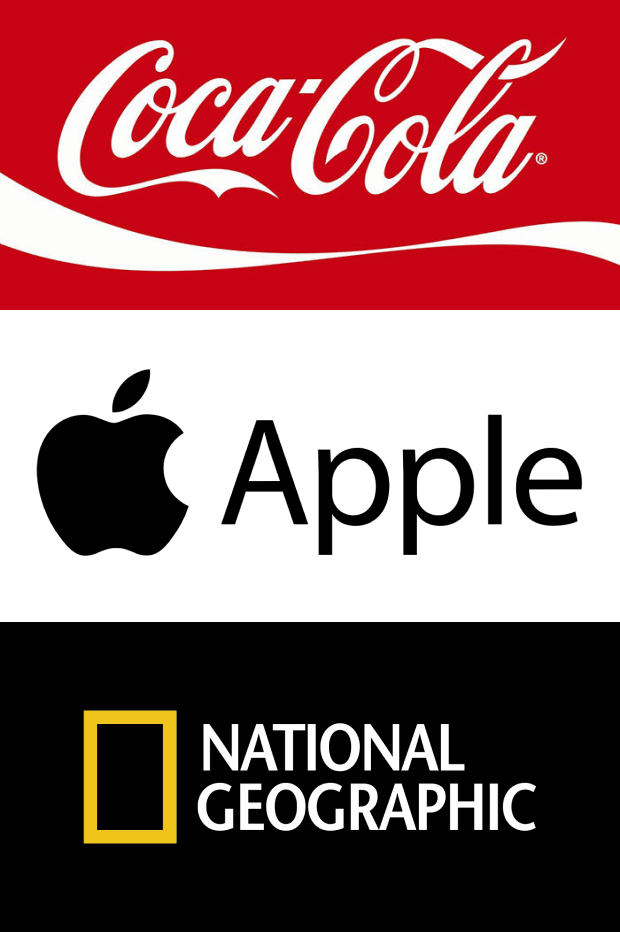
Several brands have effectively combined typography and color to create a unique brand identity:
- Coca-Cola: Uses a distinctive red color and cursive font to convey excitement and tradition.
- Apple: Employs a minimalist color palette and sleek, sans-serif fonts to reflect innovation and simplicity.
- National Geographic: Combines a bold yellow with a clean, serif font to emphasize exploration and knowledge.
By studying these examples, you can learn how to integrate typography and color into your branding strategy to create a memorable and effective brand identity.
Designing Your Brand with Imagely
Imagely provides photographers and creatives with the tools they need to build a visually compelling online presence. With the Imagely theme, you can effortlessly design a website that showcases your work while maintaining brand consistency through custom typography and color schemes. The theme is built specifically for photographers, offering flexibility to highlight your unique style and brand identity.
Plus, the NextGEN Gallery plugin integrates seamlessly with the Imagely theme, allowing you to display your photos in stunning galleries that enhance your brand’s visual appeal. The plugin comes with tons of customizable gallery layout like mosaic, masonry, tiled, and more.
Plus, it’s packed with powerful features for photographers and visual artists such as:
- eCommerce options to sell digital downloads and prints with automated print fulfillment
- Client proofing
- Adobe Lightroom integration to create and manage WordPress galleries straight from Lightroom
- Deeplinking for better SEO
- Filterable galleries and albums
- Image protection and watermarking
- Social sharing and image commenting
- Image optimization with automatic resizing and lazy loading
- Gallery animations and hover captions
- And more!
Build your website with Imagely today →
Understanding the role of typography and color theory in effective branding is essential for creating a memorable brand identity. By strategically combining colors and fonts, you can enhance your brand’s visual appeal, communicate your brand’s values, and connect with your audience on a deeper level.
Remember, branding is more than just a logo or a tagline—it’s about creating an experience that resonates and builds trust. Start applying these principles today to elevate your brand and stand out in the crowded marketplace.
Don’t have NextGEN Gallery yet? Get started today!
If you liked this article, be sure to check out SEO Tips for Photographers: How to Boost Online Visibility.
For more photography tips and WordPress tutorials, check out our blog.

