In photography and design, color is more than just a visual element—it’s a fundamental part of storytelling.
From swirling watercolors as a kid to studying studio art back in college, color has always fascinated me. Now, as a professional marketer in the photography and web design world, I’ve gained a unique understanding of how important color theory is in both an artistic and business sense.
Whether you’re capturing a serene landscape, styling models for a photo shoot, designing a website, or crafting your brand’s visual identity, mastering color theory is essential.
In this article, we’ll explore the basics of color theory for photography and design, from the color wheel and color models to the primary color schemes, providing the tools you need to make more impactful color choices in your creative projects.
What is Color Theory?
Color theory explores how different colors interact, complement, contrast, and influence each other. Using the color wheel, we can organize colors into primary, secondary, and tertiary categories. From there, color theory allows us to understand how these interactions create specific effects.
The Color Wheel: Primary, Secondary, and Tertiary Colors
Remember the color wheel from elementary school? Yep, it all goes back to that. Understanding the color wheel is fundamental for helping designers, artists, and photographers create balanced and visually appealing compositions.
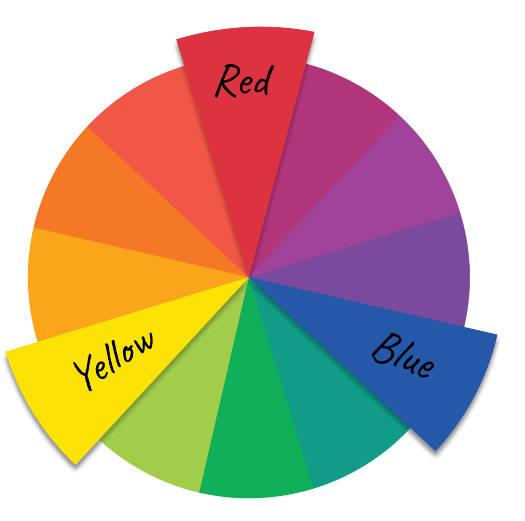
Primary Colors: These are foundational colors that cannot be created by mixing other colors. They’re the starting point for all other colors on the color wheel.
- Red
- Yellow
- Blue
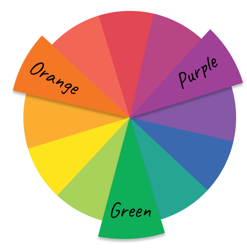
Secondary Colors: Created by mixing two primary colors together. The secondary colors are:
- Green = Blue + Yellow
- Orange = Red + Yellow
- Purple = Red + Blue
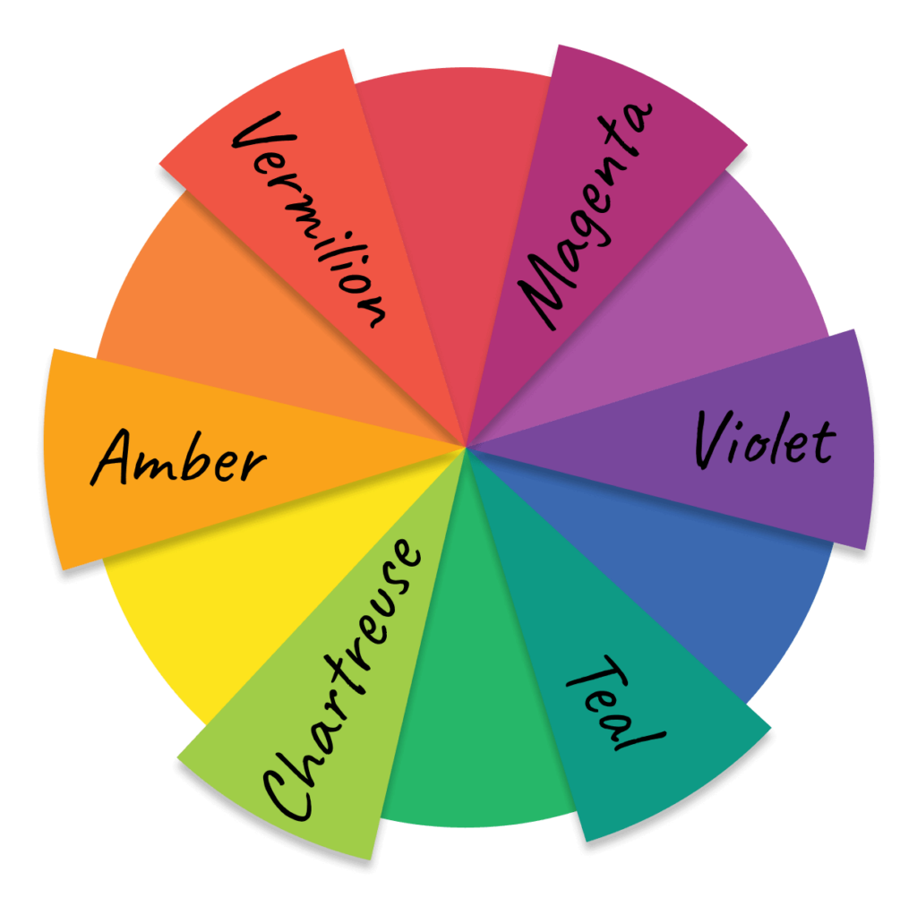
Tertiary Colors: Formed by mixing a primary color with a secondary color, resulting in six tertiary colors that add depth and variety to a color palette.
- Vermilion or Cinnabar = Red + Orange
- Amber or Marigold = Orange + Yellow
- Chartreuse or Lime Green = Yellow + Green
- Teal or Aqua = Green + Blue
- Violet = Blue + Purple
- Magenta = Purple + Red
Understanding Color Properties
Like most people, you probably just say “colors,” but there are actually many words to describe the various aspects that makeup color. It can get complicated since terms vary by industry and color model, but knowing the basics is helpful.
Hue: Used to describe the general family of color or the most visible color. Think of it as the purest form of a color.
In photography, hue is typically used to describe the most prominent color out of the 6 primary and secondary colors. For example, a photo of the sky at dusk may have a red or orange hue.
In design, we select from many more colors than those on the color wheel. So, we use a more technical definition, which describes a color that doesn’t have white, black, or neutral gray (white + black) added. For example, magenta is a hue since it’s made by mixing purple and red. On the other hand, pink is not a hue since it’s just a paler shade of red created by adding white.
- Tint: “Lighter” versions of a hue are produced by adding varying degrees of white, called tints. For example, pink is a tint of red.
- Shade: “Darker” versions of a hue produced by adding different amounts of black. For example, maroon is a shade of red.
- Tone: “Duller” versions of a hue produced by adding varying amounts of neutral gray are called tones.

Value or Lightness: Describes the amount of white, black, or gray in a color, which translates to how light or dark it is. The human eye can distinguish 10 value levels, 10 being the lightest.
Saturation or Chroma: Saturation refers to how much of the hue is present on a scale from 0-100%, which we understand as the “intensity” of a color. Chroma also measures “intensity” but is independent of factors influencing perception, such as illumination. That said, unless you’re a color scientist, just think of them as the same thing.
The 7 Major Color Schemes
Now that you’ve got the gist of how colors are measured let’s get familiar with the 7 primary color schemes: monochromatic, analogous, complementary, split complementary, triadic, square, and tetradic.
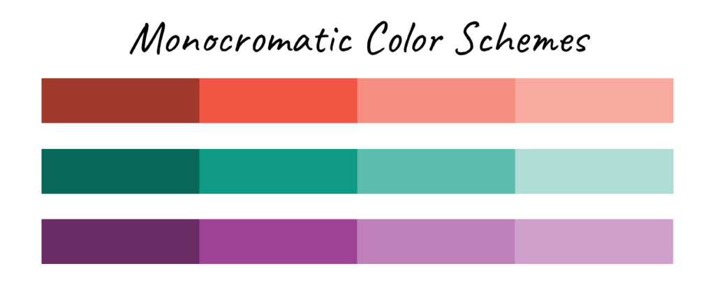
Monochromatic: Utilizes different shades, tints, and tones of a single color to create a harmonious and unified look.
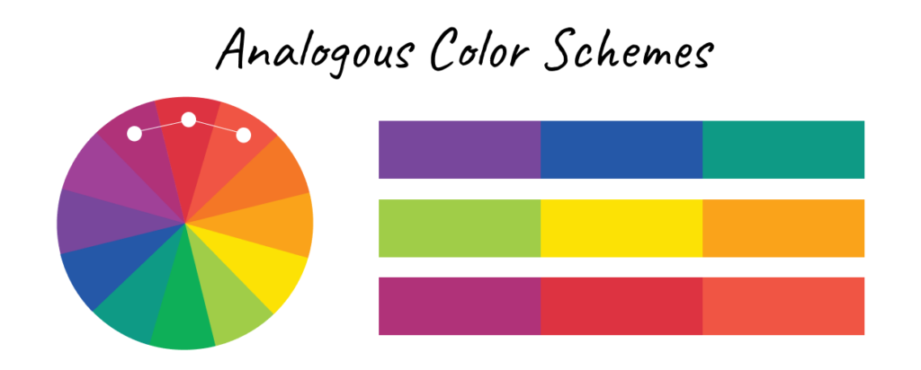
Analogous: Combines colors next to each other on the color wheel, such as blue, blue-green, and green. It’s often used to create a serene and comfortable design.
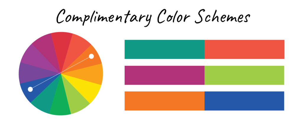
Complementary: Uses 2 opposite colors on the color wheel, like blue and orange. It’s a high-contrast combination that’s ideal for making elements stand out.
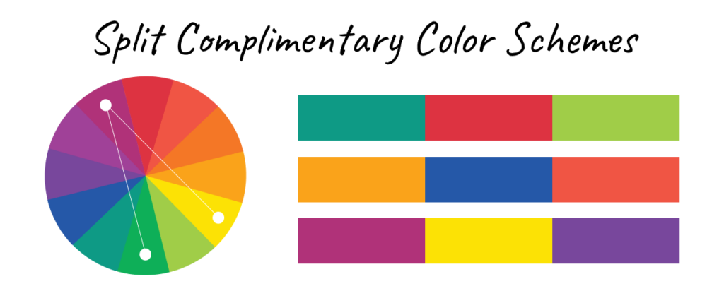
Split Complementary: A variation of the complementary scheme that includes one base color and the two adjacent colors to its complementary. This provides high contrast while reducing tension compared to a standard complementary scheme.
Triadic: Involves three colors evenly spaced around the color wheel, such as red, yellow, and blue. This scheme is vibrant and balanced, offering a diverse but harmonious palette.
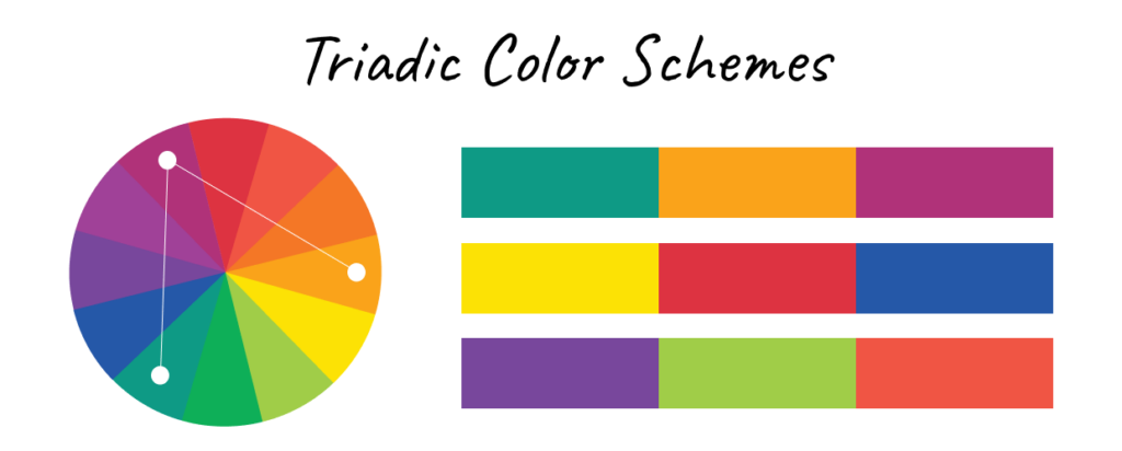
Square: Consists of four colors evenly spaced around the color wheel, forming a square. This scheme offers a balanced yet dynamic range of colors, which provides versatility in design.
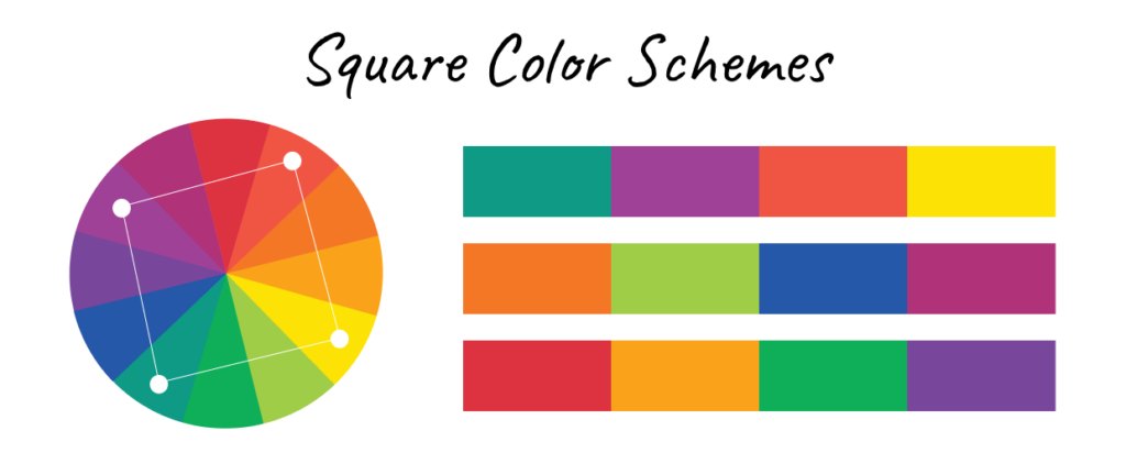
Tetradic or Rectangular: Uses 4 colors, made up of 2 pairs of complementary colors, forming a rectangle or X on the color wheel. This scheme is rich and varied, allowing both warm and cool colors to be included in the design.
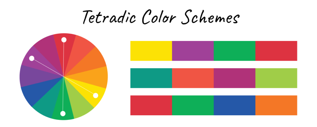
Understanding Color Models
Color models serve as a way to measure color, allowing us to describe and reproduce the desired results. They’re crucial for achieving consistency across different platforms and devices. There are many other color models, but these are the most commonly used ones:
RGB (Red, Green, Blue)
The RGB model is primarily used for digital screens, including computers, smartphones, and cameras. It combines red, green, and blue light in various intensities to create a broad spectrum of colors. This model is additive, meaning colors are created by adding light. The more light added, the closer the color moves toward white. RGB is ideal for digital photography and web design because it accurately represents how colors will appear on screens.
CMYK (Cyan, Magenta, Yellow, Black)
The CMYK model is used for printing. It combines cyan, magenta, yellow, and black ink to create colors on paper. Unlike RGB, CMYK is a subtractive model; colors are created by subtracting light from white paper. The more ink added, the darker the color becomes. It’s necessary for photographers and designers preparing their work for print delivery to understand CMYK so they can ensure the colors they see on screen will translate accurately to paper.
HSL (Hue, Saturation, Lightness) and HSV (Hue, Saturation, Value):
These models are used to represent colors in a way that is closer to human perception. HSL describes colors in terms of hue, saturation, and lightness. HSV is similar but uses value instead of lightness to represent the brightness of the color. These models are beneficial for adjusting and selecting colors in design and editing software, as they allow for more intuitive color manipulation.
Applying Color Theory for Photography and Design
In this section, we’ll cover real-world examples of using color properties and schemes to create a more significant visual impact and convey specific messages.
How to Use Color Properties in Your Work
Understanding how different color properties affect perception allows photographers and designers to manipulate these properties to better convey their message.
Hue
In photography, hue helps set the mood. For example, a photo with a dominant blue hue can evoke calmness, while a red hue can convey intensity or warmth.
In design, selecting hues that align with a brand’s identity helps communicate the brand’s core values. Check out this article to learn more about the the psychology of color in branding.
Tint, Shade, and Tone
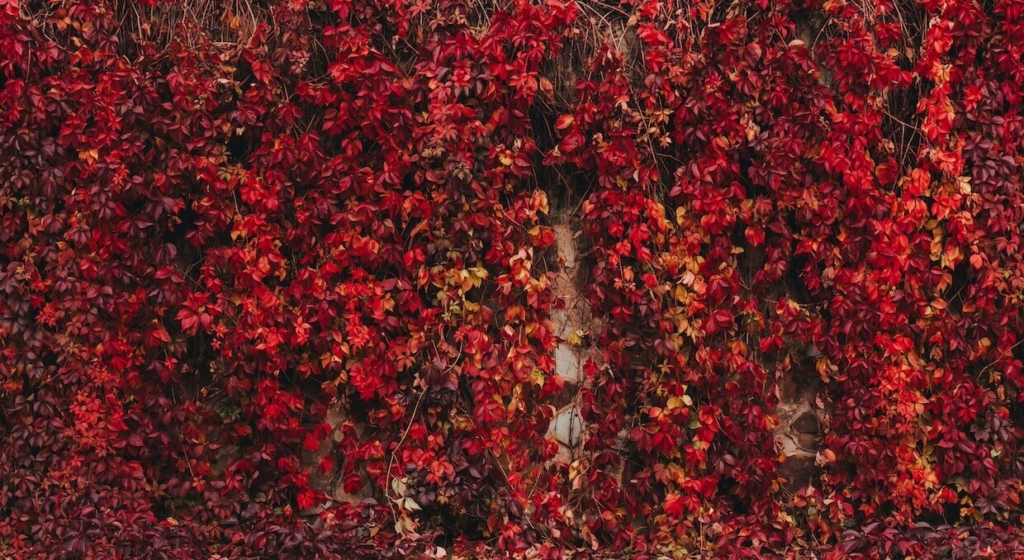
These properties allow for subtle color variations, creating depth and interest in images or designs. For example, using tints (lighter versions of colors) can create a soft, gentle effect in portrait photography or a clean, airy feel in web design.
Shades (darker versions) can add drama and contrast, which is helpful in fashion photography or to emphasize key elements in graphic design. Meanwhile, tones (colors mixed with gray) create more muted, sophisticated palettes, often used in editorial photography and minimalist web designs.
Value (Lightness)
In photography, controlling value is crucial in creating contrast and focus. It’s most noticeable in black-and-white images but applies to all photography. High-value (light) areas can draw the viewer’s eye, while low-value (dark) areas can push them away or create a sense of mystery.
In design, varying the lightness of colors can help create a visual hierarchy and guide users through a website or print layout.
Saturation (Chroma)
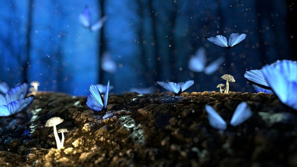
High saturation in a photograph or design can make colors appear more vivid and energetic, perfect for capturing attention in marketing materials or travel photography.
Conversely, lower saturation can create a more subdued, calm, and professional look, often used in corporate branding or lifestyle photography.
Using Color Schemes in Your Work
To effectively use color schemes in photography and design, it’s essential to understand when and why to use each type.
Monochromatic: Ideal for creating a cohesive and minimalist look, often used in fine art photography to focus on texture and form. This scheme can also create a calm, elegant aesthetic in web design, especially for minimalist brands.
Analogous: Perfect for nature photography, as this scheme mimics the natural gradation of colors found in the environment (e.g., a sunset with reds, oranges, and yellows). It can create a harmonious and soothing visual flow in design, making it great for wellness brands or any relaxing design.
Complementary: Often used in portrait and headshot photography to make the subject stand out against a contrasting background. Graphic designers use it to create eye-catching visuals, such as call-to-action buttons or focal points in advertisements.

Split Complementary: Offers versatility in web design for creating dynamic visuals that balance contrast without overwhelming the viewer. This scheme provides visual interest while maintaining harmony, which is ideal for more complex designs like infographics.
Triadic: Works well for vibrant, balanced compositions in graphic design, such as posters or flyers, where color variety is needed without compromising harmony. This scheme can be used in photography for creative, high-energy images, such as lifestyle or fashion shoots.
Square: Offers a balanced yet dynamic range of colors, useful for branding and marketing materials where versatility and a broad spectrum are needed. This scheme can add depth and dimension to designs, making them more engaging.

Tetradic (Rectangular): Best suited for designs that need a complex color palette, like seasonal advertising campaigns or multi-theme events. This scheme allows for both warm and cool colors, adding richness, variety, and vibrancy to the visual content.
Combining Color Properties and Schemes to Create a Harmonious Palette
Examples in Photography
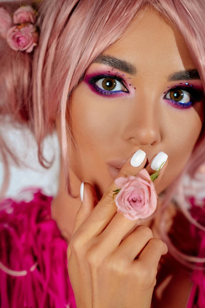
In portrait photos, using a monochromatic color scheme with numerous tints and shades combined with color properties like high saturation can draw viewer’s attention to the focal point while creating a harmonious feeling.
Complimentary color is also used quite often in headshot photography to create a strong contrast between the subject and background (e.g., a blue background with an orange subject). When combined with tints, shades, and tones on the subject, you can draw attention to textures and subtle details, which is particularly useful in product photography.
In landscape photography, a monochromatic scheme using various tints and shades of green can evoke a sense of tranquility and harmony with nature. Enhancing the saturation of greens will make the foliage more vibrant, while a lower saturation might be used to create a moody, atmospheric effect, perfect for misty morning shots.
In this landscape photo, the orange mountains and blue water and sky create a complimentary palette that pops due to the high saturation. The tints in the snow and reflection in the water add a dynamic element that pulls the viewer’s eye forward. Meanwhile, the shades in the foliage create depth and the tones in the mountains help to show texture while not overwhelming the image.

Examples in Web Design
A split-complimentary or triadic palette can provide a strong visual contrast while maintaining harmony, making the design both vibrant and balanced. By combining this scheme with value, designers can create a visual hierarchy using a high-value (light) background with bold, high-saturation buttons to intuitively guide users through a site.
A great example of this is SeedProd, a popular web page builder for WordPress. The brand prominently features orange as its primary color, with purple and green as accent colors.
The orange conveys energy, enthusiasm, and warmth, which can encourage action. The hints of purple in the logo and elsewhere add visual interest while the green accents help guide the user’s attention to conversion-boosting elements, such as call-to actions.

For a brand aiming to convey reliability and creativity, an analogous palette scheme can be balanced with varied tones to create a sophisticated yet approachable design. The tones provide a muted backdrop that allows brighter elements to stand out, drawing attention to key messages.
For example, the MonsterInsights website, a well-known Google Analytics plugin, uses various shades of blue along with a purple logo to convey creativity and innovation while maintaining a sense of calm and reliability.

Design Your Photography Website with Imagely
Applying color theory can transform your photography and design work, making it more impactful and engaging. But to showcase your work online, you also need a powerful, photographer-friendly website.
That’s where Imagely comes in—a WordPress theme designed specifically for photographers. The Imagely theme helps you create a stunning, professional website that aligns with your creative vision, and NextGEN Gallery is the best gallery plugin available. It provides advanced features for displaying, managing, and selling your work directly from your WordPress website.
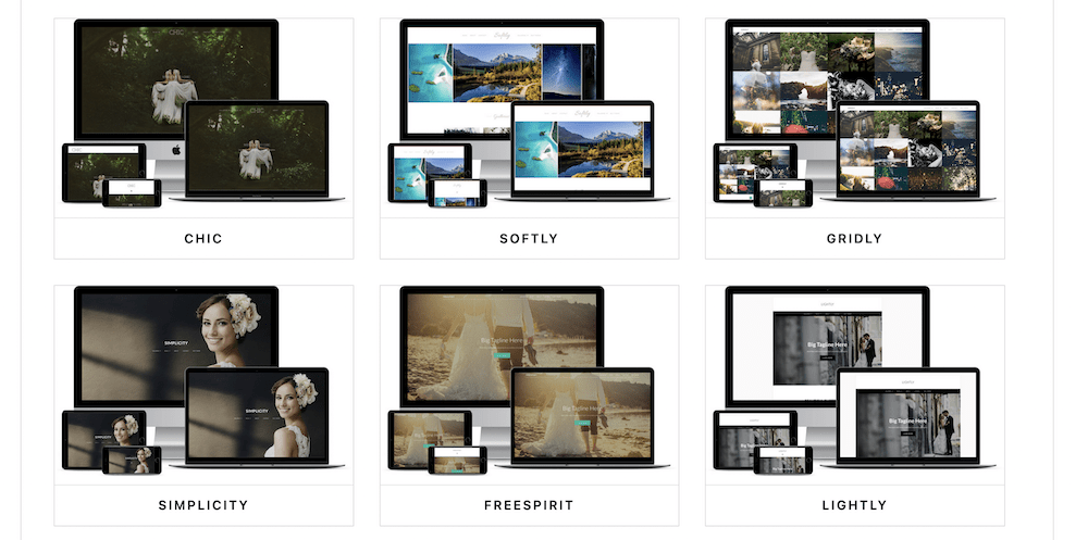
With all the tools you need to design a stunning website, present your images, and sell your work, Imagely ensures your use of color and design is showcased to its fullest potential.
Frequently Asked Questions
1. What is color theory in photography?
Color theory in photography refers to the study of how colors interact and the visual effects of color combinations. Photographers use color theory to create mood, emphasize subjects, and convey messages by understanding relationships between colors on the color wheel, such as complementary, analogous, and triadic schemes.
2. How do photographers use the color wheel?
Photographers utilize the color wheel to select subjects with harmonious colors that will enhance their images. Studying the color wheel also helps photographers quickly recognize naturally occurring combinations that will convey a certain mood in their work. For instance, complementary colors (opposite on the wheel), like an orange sunset over blue water, can create striking contrast, while analogous colors (next to each other), like a blue sky and rolling green hills, offer a more cohesive look.
3. Why is color important in photography?
Color plays a crucial role in photography by influencing the viewer’s perception and emotional response. It can highlight subjects, set the tone, and add depth to images. Understanding color theory enables photographers to make intentional choices that enhance storytelling and visual appeal.
4. How does color theory affect design?
Color theory affects design by influencing how audiences perceive and interact with visual content. Proper use of color can improve readability, draw attention to key elements, and create a cohesive look that aligns with the intended message or brand identity. Designers apply color theory to evoke emotions, establish brand identity, and guide user attention within a composition.
By thoughtfully combining color schemes and manipulating properties, photographers and designers can craft images and designs that are aesthetically pleasing and strategically convey a mood, emotion, or message.
Whether you’re working on a photo shoot or creating your website, this holistic approach to color can enhance the overall impact of your creative work.
We hope this guide helped you learn more about color theory in photography and design. Ready to dig deeper? Check out our guide on Color Psychology for Branding.
Don’t have NextGEN Gallery yet? Get started today!
For more photography tips and WordPress tutorials, check out our blog.

