


When I first started working with WordPress, one of the most confusing areas was figuring out which image sizes to use—and where. How do you ensure your site looks consistent without uploading five versions of the same photo?
Or as one photographer put it:
“Should the images I use for featured images, backgrounds, blog posts, and galleries all be uploaded at a same optimum size? Or are there different recommended minimum and maximum sizes for different uses?“
As a member of the Imagely team, I’ve spent years helping photographers build visually stunning, high-performing websites on WordPress. Through hands-on experience and extensive testing, I’ve learned that choosing the right image dimensions is just as important as capturing the right shot. The wrong sizes can lead to pixelation, awkward cropping, layout issues, and yes—slower load times.
In this guide, I’ll walk you through everything you need to know about WordPress image sizes—from how WordPress handles image files behind the scenes to the best dimensions for headers, blog posts, galleries, and more. Whether you’re a business owner building your brand or a creative refining your portfolio, you’ll find clear, actionable advice to make your images look their best.
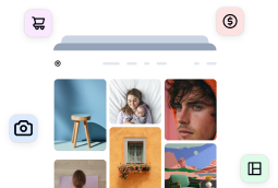
Understanding WordPress’s Default Image Handling
When you upload an image to WordPress, it doesn’t just store that one version. Instead, WordPress automatically creates several resized copies in different dimensions to use across your site. This system is designed to improve performance and ensure your images fit various layouts—but for photographers, it can quickly lead to media library clutter and confusion if not managed carefully.
Let’s take a closer look at how WordPress handles image sizes by default and what that means for your workflow.
What Are the Default Image Sizes in WordPress?
When you upload an image to WordPress, the system automatically creates and saves these standard image sizes:
- Thumbnail: 150×150 pixels (cropped square)
- Medium: Maximum dimensions of 300×300 pixels (proportionally scaled)
- Medium Large: 768px wide (height scales proportionally). This size is hardcoded and used for responsive images.
- Large: Maximum dimensions of 1024×1024 pixels (proportionally scaled)
- Full Size: The original uploaded image
Some website themes or plugins may add additional custom image sizes to this list. Every time you upload a single image, WordPress creates all these variations and stores them on your server.
How Can I Change the Default Image Sizes in WordPress?
The image sizes WordPress generates by default don’t always align with the layout or style of your website. For instance, if your blog layout features wide rectangular featured images, the default square thumbnails might crop your photos in ways that feel off.
Luckily, you can easily update these size presets in your WordPress settings to better match your website design. Here’s how to do it:
- Head to the Media Settings Panel: From your WordPress dashboard, go to Settings » Media. Here, you’ll find fields where you can set custom dimensions.
- Customize the Image Sizes: You can adjust three key image sizes:
- Thumbnail: Choose the width and height you’d like thumbnails to follow. Check “crop thumbnail” to force images into those exact dimensions, or leave unchecked to scale proportionally.
- Medium: This size is often used inside blog posts or for sidebar images. You can update these dimensions to better reflect the typical width of your content area.
- Large: Choose dimensions that suit your theme’s full-width sections, like header images or background visuals.
- Apply Your Changes: Once you’ve adjusted the settings, click Save Changes at the bottom of the screen.

Making these adjustments gives you more visual consistency throughout your site and ensures your images look their best.
Pro Tips for Managing WordPress Image Sizes
- Changes Only Affect New Uploads: Updating image size settings won’t retroactively resize existing images. To apply new dimensions to old uploads, you can use a free plugin like Imsanity.
- Flexible Height Trick: Need to set a max width but keep the height flexible? Enter
9999in the height field. This is especially helpful for portrait images, infographics, or any visuals with varying vertical dimensions. - Skip Forced Cropping for Flexibility: If you’re already uploading featured images at consistent dimensions, it’s usually best to leave the crop option unchecked for thumbnails. This lets WordPress scale images proportionally, so you can still use the thumbnail size on other photos—without dealing with awkward crops.
- Understanding Medium Large: As mentioned before, WordPress also creates a Medium Large size by default (768px maximum, with proportional scaling), but you won’t see it in the Media Settings screen. It’s used behind the scenes for responsive image delivery and can’t be changed through the dashboard.
What Aspect Ratio Options Are Available in WordPress?
The WordPress block editor (Gutenberg) makes it easier than ever to control how images appear on your site. When you insert an image block, you can use the Aspect Ratio settings in the right-hand panel to fine-tune display. The options include:
| Original (Native) |
Displays the image as it was originally captured, preserving the native width-to-height proportions without cropping or stretching. |
| Square (1:1) |
A perfect fit for logos, profile images, thumbnails, product previews, and Instagram-style layouts. Great for uniform grid displays. |
| Standard (4:3) |
Once the default for older screens and cameras, this ratio still works well in blog content, sidebars, and smaller layouts where balance and readability are key. |
| Portrait (3:4) |
This vertical ratio is commonly used for headshots and team bios. It’s a go-to for showcasing people-focused images in a compact space. |
| Landscape (3:2) |
A favorite among photographers, this aspect ratio reflects the standard output of many DSLR and mirrorless cameras. It’s widely used for landscape shots and featured images. |
| Vertical (2:3) |
Similar to 3:2, but flipped for vertical composition. It’s often used in portrait photography, fashion imagery, and vertical blog visuals. |
| Widescreen (16:9) |
Today’s most common ratio for videos, full-width sliders, and hero sections. It’s perfect for featured content that spans the content area. |
| Tall (9:16) |
This vertically extended format is ideal for modern content types like Instagram Reels, YouTube Shorts, and infographics. Great for mobile-first visual storytelling. |
If you want to set a custom ratio for any image, simply set the Width and Height fields. You’ll also notice a Resolution dropdown where you can select which default size to use as the source image (Thumbnail, Medium, Large, or Full Size).

Consistent aspect ratios play a key role in creating a clean, cohesive look across your photography website. Whether you’re building a portfolio, adding featured images to blog posts, or creating an online store, aligning your images helps your content feel intentional and polished.
The Problem with the Standard Approach
For most website owners, WordPress’s above approach works fine. For photographers, however, it creates several issues:
- Media Library Bloat: A single high-resolution photo can generate 4+ duplicate files, quickly filling up your storage.
- Quality Limitations: The default sizes might not be optimal for showcasing your photography work.
- Workflow Inefficiency: You might find yourself manually resizing images before upload or spending hours setting custom dimensions in your theme’s PHP file.
- Concerns for Prints and Digital Downloads: When selling prints or digital downloads, you need to provide original high-resolution files.
Stop Resizing. Start Showcasing.
Imagely handles image resizing and compression for you. Just upload your full-res files—Imagely takes care of storing originals and generating display-ready sizes, without bloating your media library.
The Solution for Photographers
The majority of WordPress gallery plugins rely on the WordPress media library and the core WP functions to handle photos, which often falls short for photographers who need both high-performance display and access to original files for print and digital sales.
Rather than relying on WordPress to generate and manage multiple duplicate image sizes, Imagely’s plugin, NextGEN Gallery, offers a smarter solution: the Backup and Resize method.

Here’s how it works:
- Upload Full-Size Originals: Start by uploading your high-resolution, full-quality images directly in a gallery.
- Automatic Backup: NextGEN Gallery automatically stores a secure backup of each original file.
- Smart Resizing for Display: The plugin then generates optimized versions of your images for frontend display—based on your selected settings.
- eCommerce-Ready Originals: When you sell prints or digital downloads, the system always uses the original full-resolution image for fulfillment.
This approach gives photographers the best of both worlds: automatically resized images for display and original files preserved for sales. It also reduces clutter in the media library and eliminates the need to manually resize images before upload—streamlining your workflow from start to finish.
Recommended WordPress Image Sizes
The optimal size for your WordPress images depends significantly on your hosting provider and environment. More powerful servers can handle larger images without performance issues. Here are our recommendations for maximum image dimensions based on hosting type:
- Shared Hosting: Up to 1400px on longest side
- Cloud Hosting: Up to 1800px on longest side
- VPS Hosting: Up to 2200px on longest side
- Dedicated Hosting: Up to 3000px on longest side
When deciding on image sizes, remember that your hosting type is often more important than what theme or plugin you’re using—powerful hosting can handle larger images, while shared hosting requires more careful sizing.
These guidelines help balance quality and performance regardless of which theme you’re using, but it may be safe to go slightly larger if you’re using a decent CDN (Content Delivery Network).
Now, let’s break down the recommended dimensions for specific website elements:
Header Images and Sliders
Header images and sliders often span the full width of your site, and you want to make sure they’re crisp. I recommend a width between 1920px and 2560px with a 16:9 ratio. 1920px × 1080px is the go-to size, but photographers may want to use 2560px × 1440px to ensure details remain in-tact.

When a very wide, panoramic ratio is needed, 2000px × 600px works well for most modern themes —commonly used for banners or full-width header images across the top of a website. It’s much wider than the typical 16:9 ratio and creates a strong horizontal emphasis.
Site Logo: Many website owners also include a site logo in their header or navigation bar. 250px × 100px (landscape) and 160px × 160px (square or vertical) is standard, but you’ll want to check your theme’s recommendations.
Featured and In-Post Images
Featured images appear at the top of posts and pages. 1200px × 675px (16:9) is a safe choice for consistent display across most themes and social platforms, while 1200px × 628px is ideal for Facebook and LinkedIn sharing. If you prefer a 4:3 ratio, 1200px × 900px is also a popular size for single column layouts.

For full-width images within your blog content, match the image width to your blog’s content area—often between 800px and 1200px wide, depending on your theme. For a uniform look, 4:3 and 16:9 aspect ratios are often used, but many blogs (like ours) don’t specify the height since we prefer to let the images automatically scale to avoid cropping content.
If your blog posts have a two-column layout, a width of 680px often works well. For sidebar images, 300px to 400px width works well for most sidebar layouts.
Portfolio, Gallery, and eCommerce Images
If you’re a photographer, image sizing is more than just aesthetics—it’s about streamlining your workflow, optimizing performance, and ensuring high-quality presentation across devices.
As I mentioned before, when you upload full-size originals using NextGEN Gallery, the plugin creates resized, optimized versions for display on your site while keeping your high-resolution files safely stored in the background.
The plugin will use the original, full-resolution images for all print fulfillment and digital downloads. This ensures customers always receive the highest quality file—even if you’re displaying a resized version on your website.
When preparing your originals, we recommend:
- Format: JPG file
- Color Profile: sRGB color profile
- Dimensions: Equal to the max size available for sale or download on your site. For optimal clarity, we suggest at least 2000px–3000px on the longest side and 300 DPI for print fulfillment.
- Print Resolution: Ensure images meet minimum resolution requirements for print fulfillment
Set Your Global Image Sizes
You can enable original backups and configure your default resizing and compression settings under NextGEN Gallery » Other Options » Image Options.

From here, we recommend:
- A maximum of 1920px ×1280px for resized images: This provides a sharp frontend experience without slowing your site down.
- A quality setting between 80–85% compression: This compression level strikes a great balance between visual quality and performance.
For thumbnails, 240px × 160px are the default dimensions, but you can also click the Thumbnail Options tab to customize this.

You’ll also see an option to Set fixed dimension. When enabled, thumbnails will be cropped to the specified dimensions instead of scaling proportionally.
To adjust crop settings for your built-in lightbox, click the Lightbox Effects tab, select NextGEN Pro Lightbox in the dropdown, and scroll down to the Lightbox and Image Sizing section. Here, you can specify how photos scale and crop in the lightbox, and you can even enable a Pan option, which lets visitor pan images using the mouse.
Customize Sizes by Gallery Style
For more granular control, head to NextGEN Gallery » Gallery Settings. The default settings are already optimized for most users, but you customize sizing for individual gallery styles if needed:
- Image Sizes: Set image sizes for specific galleries layouts. For example, you may want to set images in a blog-style layout to 1200px width to match the dimensions you use for featured images.
- Custom Thumbnails: Override your default thumbnail size and enable/disable cropping as needed. For example, you might want grid galleries to crop thumbnails to a square ratio, while thumbnails in your other galleries scale proportionally.
- Gallery Dimensions: Adjust how large specific galleries are on the page. For example, you could set a uniform height for sidescroll galleries or a standard aspect ratio for filmstrip galleries.
Frequently Asked Questions
1. What is the ideal image size to use on WordPress?
The best image size depends on where the image will be used. Here are some guidelines:
- Featured Images for Blog Posts: 1200×675 pixels (16:9 aspect ratio) is a versatile choice that looks great across most WordPress themes and displays well in blog feeds and post headers.
- Social Media Sharing (Open Graph): 1200×628 pixels is ideal for sharing on Facebook and LinkedIn, which follow the Open Graph standard for preview images.
- Header or Hero Images: Use 1920×1080 pixels for full-width sections or 2560×1440 pixels for higher quality and more detail.
- In-Post Content Images: Images sized between 800px and 1200px wide work well, depending on your theme’s content width.
- Thumbnails: Typically 150×150 pixels for preview grids or galleries.
Choosing the right image size helps ensure fast loading times while maintaining a polished, professional appearance across your site.
2. What’s the difference between image file size and dimensions?
- Image dimensions refer to the physical width and height of an image, measured in pixels (e.g., 1200 × 800px). This affects how large the image appears on the screen and plays a key role in layout and responsiveness.
- File size, on the other hand, is the amount of storage space the image takes up on your server, measured in kilobytes (KB) or megabytes (MB). This impacts how quickly your image loads on the web.
For example, two images may both be 1200 × 800 pixels, but one could be 200KB and the other 2MB depending on the file format, resolution, and compression settings.
Pro Tip: Aim to keep most image file sizes under 300KB for web use, even if the dimensions are large. Compressing images without sacrificing visual quality helps improve SEO and site speed. If needed, you may be able to go up to 500KB if lazy loading and a CDN are in use.
3. Does WordPress automatically resize images?
Yes, WordPress automatically creates several resized versions of every image you upload. These resized versions are used throughout your theme—such as in blog feeds, sidebars, galleries, and featured images—to improve performance and ensure images display at the appropriate dimensions.
In addition to the Full Size (original) image, WordPress generates:
- Thumbnail (150×150px)
- Medium (300×300px)
- Large (1024×1024px)
- Medium Large (768px wide) sizes, in addition to keeping the Full Size (original) image.
You can customize these default sizes in Settings » Media, and some themes or plugins (like Imagely) add their own image size settings as well.
4. What image formats are best for WordPress?
Choosing the right image format is crucial for performance and quality:
- JPEG: Best for photographs and images with many colors.
- PNG: Ideal for images with text or requiring transparency.
- WebP: Modern format offering superior compression and quality, recommended for faster loading times.
5. How do I maintain consistent aspect ratios across my WordPress site?
Consistent aspect ratios enhance the user experience and maintain a professional appearance. To ensure visual consistency:
- Use the same aspect ratio for images within the same section (e.g., all gallery thumbnails as 1:1).
- Crop images before uploading to match the desired ratio.
- Utilize WordPress’s block editor to select or adjust aspect ratios for individual images.
- Implement CSS to enforce aspect ratios across different devices and screen sizes.
Managing image sizes in WordPress doesn’t have to be complicated. By following the recommendations in this guide and using tools designed specifically for photographers, you can create a streamlined workflow that preserves your originals while optimizing the viewing experience.
Imagely makes this process simple by storing your original uploads safely while creating optimized versions for frontend display:
- Maintains Original Files: Safely stores your high-resolution originals.
- Automatic Resizing: Creates appropriately sized versions for your website.
- Streamlined Management: Controls image dimensions without cluttering your media library.
- Sell-Ready Originals: Preserves high-resolution files for print sales and downloads.
This approach eliminates the hassle of pre-resizing images before upload or dealing with a cluttered media library. To learn more about all of the Imagely’s photography-tailored tools, read our full NextGEN Gallery review to explore all features and see if Imagely is right for you.
Don’t have Imagely Pro yet? Get started today!
For more photography tips and WordPress tutorials, check out our blog.


Hello,
After reading a few articles here on image optimization, I am trying to make sure I understand what I am reading. Can you confirm that this is what they articles are say?
1. If you want to implement digital downloads and print fulfillment, and use Adobe Lightroom to upload, then you should upload at full resolution, 100% quality, and 300 DPI, in sRGB right?
2. After the gallery is uploaded, navigate the NextGen Manage Galleries, and you should resize the images in the gallery to an appropriate size, say less that 1000 px in a Shared Hosting environment, right?
Understood that there are image optimization applications that can help, but I would like to do this without additional software.
Thank you for your help!
Thank you for your question. I’m preparing a video and article to simplify this for you!
Eu uso o NextGEN Pro, e percebo que ele realmente faz o redimensionamento, exibindo assim uma foto bem menor no front end, e mantendo um backup do arquivo original, sendo perfeito para downloads digitais.
Eu tenho o imagify, e portanto, minha pergunta é: O que ele faz não é basicamente o que o NextGEN já faz?
Imagify compresses the image displayed on the front end to save space and make your images load faster. But it does it in a way that doesn’t degrade the visual quality of the images.
Most web-optimizer apps offer an option for quality. I usually set it on 80%, but it’s just a random choice. Do you have any suggestion on this topic also?
You’ll need to test to determine which settings you prefer for your own website. There is no one answer.
Does NextGEN support any Retina displays? Such as 1.5x, 2x and 3x? If not, is that on the roadmap to fix?
NextGEN Plus and Pro will automate retina by having Resize on Upload & Backup Originals turned on.
So far, I haven’t seen how Resize on Upload & Backup Originals has made any difference to my image previews– I’m waiting to hear back on a ticket I opened about that. But regarding your recommended sizes, do those take Retina into account, or should we double them for that purpose?
If you have the settings on and then look at your image thumbnails on a retina screen versus a standard screen you’ll notice a pretty big difference.
The retina feature will automatically create the 2x image, so all you need to do is upload your image at a decent size, and then NextGEN Gallery will create the thumbnail sizes appropriately.