As a photographer, you know that a website is more than just a place to store images. It’s your digital storefront where potential clients can see your work, learn about your services, and get in touch with you.
A well-designed website lets you showcase your work exactly how you want, engage potential clients, and even sell prints or share proofing galleries, but how do you make your site stand out in a sea of photography websites? Looking at examples of popular photography websites is a perfect place to start!
Studying other photographers’ websites is a great way to gain insight into what works. In this article, we’ll look at a few of the best photography web pages and their design strategies to give you inspiration for how to create your own photography website.
Our Top Picks for the Most Inspiring Photography Websites
1. Vincent Versace
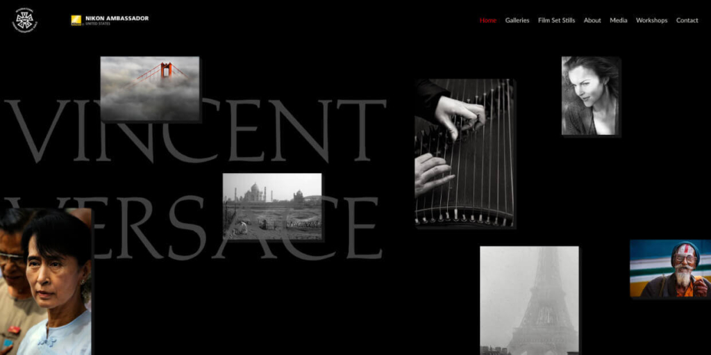
Years ago, I had the opportunity to work as an assistant for Vincent Versace, and his passion for photography is just as striking as his portfolio. As one of Nikon’s founding Ambassadors and a Smithsonian award recipient, Vincent’s expertise is undeniable, with his work included in the Museum of American History’s permanent collection.
His website reflects his mastery with an impactful design that features bold text, high-resolution portraits, and an animated header that brings his work to life. The moving images in the header draw you in, adding a dynamic layer to his storytelling.
I remember trimming prints from one of his trips to Cuba while listening to wild stories of his past travels. His site feels like an extension of his experiences—focused entirely on capturing humanity, stripped of any distractions, and centered around the beautiful storytelling in his work.
2. Corbin Gurkin
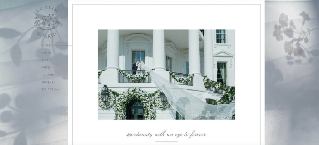
Corbin Gurkin’s website feels as intimate and elegant as her wedding photography. The minimalist design has soft colors and ample white space that evokes the feel of a beautifully crafted wedding invitation. Her work is presented with simple, understated elegance, allowing the timeless beauty in each image to take center stage.
Gurkin specializes in destination weddings, and her site makes this clear with a clean, easy-to-follow menu, portfolios organized by destination, and seamlessly flowing sections. This layout offers ideal inspiration for wedding photographers who want to create a gentle, romantic experience for potential clients.
3. Levon Bliss
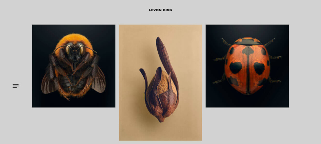
Levon Biss’s website is as precise as his macro photography. Known for hyper-detailed images of insects, he showcases his work in a clean, structured format. The ample use of white space combined with virtually no text allows the intricate details of each photograph to shine.
To further eliminate distractions, he uses a full-screen overlay for navigation that’s only visible when clicked. It’s straightforward and guides visitors to his impressive projects, including his renowned “Microsculpture” series. Overall, the site feels more like a scientific exhibit, which is fitting. It’s a great example of a niche photography website where clarity and focus are paramount.
4. Will Bremridge
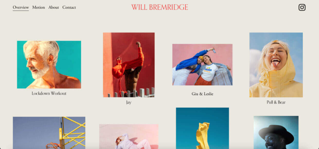
Will Bremridge’s website stands out with its bright, sunny approach to lifestyle and travel photography. What makes the site especially unique is the creative use of in-motion GIFs within his portfolio, adding a dynamic element that brings the images to life. The clean, straightforward design contrasts with the lively visuals, creating a fun yet polished experience for the visitor.
The minimalist design ensures that the focus remains on the photography and motion shots. We particularly like his gallery that displays images of varying sizes in a grid-like layout. It’s a risky choice, as a grid can often look cluttered or sloppy when photos aren’t uniform. However, the ample margins and white space counteract this, creating a playful feeling that aligns nicely with his brand.
5. Jade Maguire Photography
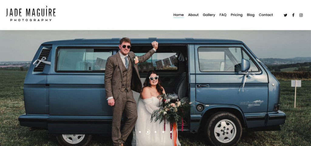
Jade Maguire sets herself apart from the typical soft and romantic wedding sites. Her website is bold, edgy, and unapologetically anti-traditional—much like her wedding photography. Her use of textured backgrounds, “ripped” pages, distressed fonts, and paint splatters on photos gives the site a rebellious vibe. From the get-go, it’s clear that her work caters to couples looking for something different.
The site’s layout is a perfect example of organized chaos that works. It pairs large, non-traditional wedding photos with eye-catching visual elements and bold, attention-grabbing headlines. Yet, it still manages to feel completely cohesive. Jade Maguire’s photography website is one of the best because it packs a punch that reinforces her unconventional approach and reflects her unique brand of wedding photography.
6. Haris Nukem
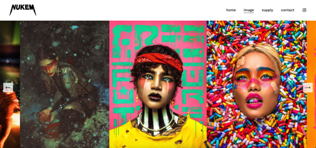
Haris Nukem’s website is a visual experience that mirrors his bold, stylized fashion photography. You’re met with high-contrast, full-screen images that exude energy and attitude from the first moment you land on the site. The stark, minimal design complements his editorial photography, often capturing raw emotion in colorful, highly stylized urban settings.
The simplicity of the navigation keeps the focus on the images, with limited text and full-bleed visuals that dominate each page. His website feels more like an art gallery than a traditional portfolio, perfectly reflecting the boundary-pushing nature of his work.
7. Paul Seibert Photography
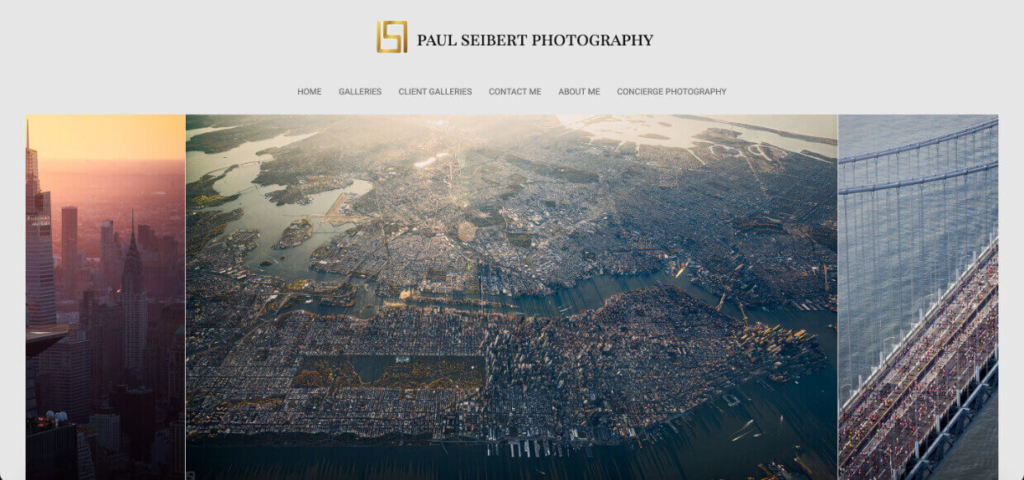
Paul Seibert’s work is all about expansive cityscapes and breathtaking views. The homepage immediately draws you in with a full-width image slider featuring high-resolution photos that convey the scale and depth of his work.
The lack of text combined with a center-placed header and footer draws your eye to the middle of the page, which allows the images to stand front and center. A center logo that cuts the menu in half is often considered bad for user experience, but in this case, the menu is below the header. This ensures intuitive navigation while the space around the header amplifies the sense of vastness felt in aerial photography.
The fog-colored background and dark tones throughout the site add a moody, atmospheric feel that mirrors the photos. Each section feels expansive, giving the viewer room to breathe while exploring his work. These design choices highlight the power of using negative space to enhance the visual impact of large-scale photography.
8. Tim Hawley
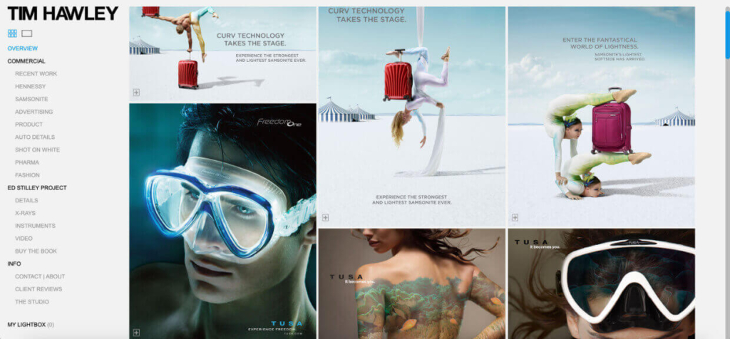
Tim Hawley’s website is a slick, professional-looking platform that showcases his unique commercial photography. The design is sharp and modern, with a large masonry gallery that instantly grabs your attention. His work focuses on eye-catching advertisements and product photography, and his website effectively relays this by categorizing his portfolio and highlighting the brands he’s worked with.
The sidebar navigation is a smart tactic as it allows him to display a lot of information in the navigation without detracting from the images. Overall, this photography webpage creates the impression of efficiency and creativity, which is excellent for his marketing-focused pictures.
9. Alexi Papaki
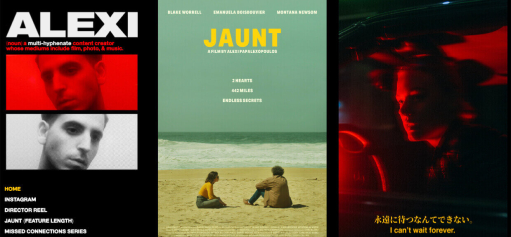
Alexi Papaki’s website is a powerful blend of photography and cinematography, perfectly reflecting his bold, gritty aesthetic. The homepage greets visitors with a dark, moody design, immediately setting the tone.
Fast loading visuals dominate the layout—a dynamic gallery comprised of striking images alongside auto-play film clips and scrolling carousels. There’s a strong focus on motion and energy, while the simplicity of the navigation eliminates distractions. Bold colors and typography help create a sense of intensity and rawness that mirrors the work.
10. John & Joseph Photography
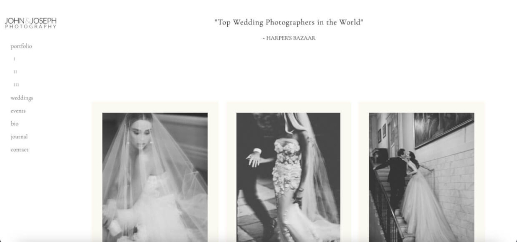
The John & Joseph Photography site exudes luxury and sophistication, much like the high-end weddings they capture. Unlike many photographers’ websites, this one forgoes the header image. Instead, a simple quote from Harper’s Bazaar, “Top Wedding Photographers in the World,” sits at the top of the page, instantly painting them as an upscale brand with high credibility.
The design is clean and extremely minimal. Monochrome photos on the homepage, framed in cream and featuring “Vogue,” showcase their distinct style of photojournalism-meets-high-fashion photography. Meanwhile, the layout and navigation offer a seamless browsing experience that feels simple and polished. Its refined aesthetic makes it a top photography webpage for appealing to high-end wedding clients.
11. Monaris
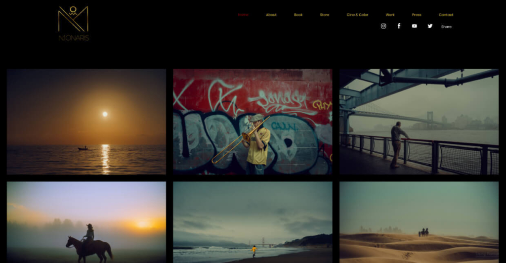
Monaris’ website is as cinematic as the moments she captures. A beautiful grid portfolio on the homepage with images that look straight out of a movie scene greets visitors. Smooth scrolling and subtle gallery animations add to the effect, making it feel like you’re looking through stills from a film.
The black background with touches of primary colors pairs well with her work, which centers around using compositions and color theory to create narrative-driven photography. This is particularly evident in the lightbox view, where full-screen images draw users into the stories created through her lens.
12. Lara Jade
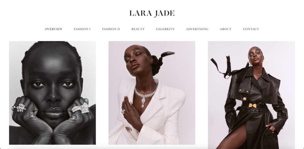
Lara Jade’s website perfectly reflects her luxurious, high-end fashion and beauty photography. The homepage instantly sets the tone with striking editorial photos in a gallery that feels both refined and glamorous.
The sleek and minimal design emphasizes large, optimized images that draw visitors into her world of high fashion. The pure white background and extra spacing between gallery images make the full range of skin tones pop, which is crucial for a portfolio of fashion and beauty shots. The menu is uniformly spaced, and the typography is a recognizable serif typeface (Baskerville) that Vogue Magazine often uses.
All of this aligns perfectly with Lara Jade’s brand and works together to create an impression of being expensive, stylish, and sophisticated (I’ve been thinking about Paris Fashion Week for the last 5 minutes, so I’d say it’s working).
13. J. La Plante
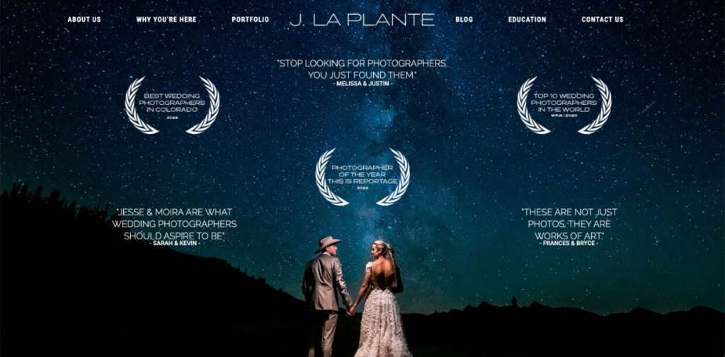
J. La Plante’s website emphasizes bold, vibrant imagery that perfectly reflects the adventurous spirit of elopements and destination weddings. The design is modern and immersive, with large, full-width images that immediately pull visitors into the stunning locations and intimate moments captured in the photographer’s portfolio.
The layout focuses on the visuals while using strategically placed CTAs (call-to-actions) to encourage bookings. For example, the “Now Booking” banner below the homepage hero image is an excellent way to drive conversions. We also love the use of testimonials and awards on the hero image. The delayed animation grabs your attention and helps build credibility quickly while still feeling cohesive.
14. Bryan Minear
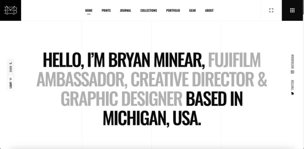
Bryan Minear’s website’s striking black-and-white design complements his colorful, atmospheric landscape photography. The homepage goes against the norm, with no images placed above the fold. Instead, he uses a full-width headline to introduce himself.
This design choice makes his work feel more personal and inviting, contrasting with the rugged, moody landscapes he captures. He further leans into the friendly feel by using elements that make a website feel more approachable, such as rounded corners and generous negative space in his galleries.
Throughout his site, subtle design techniques continue to foster a feeling of familiarity. For example, his footer contains a funny typing text animation, and his photography blog is titled “Journal,” instantly making it feel more personal. His photography is high-contrast with lots of reds and oranges, which could evoke anxiety, but the approachable elements balance this out without distracting from his work.
15. Emilee McGovern
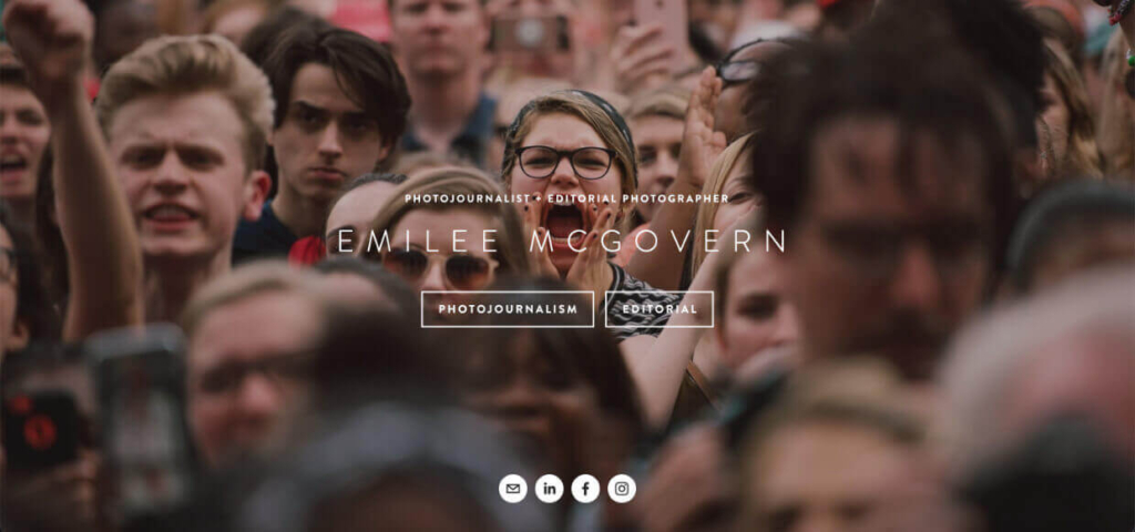
Much of Emilee McGovern’s work focuses on activism and political protests, and her website is a powerful example of how design can complement the storytelling aspect of photojournalism.
She uses a front page with a full-screen image that immediately invokes a feeling of determination and outrage before you even enter the site, gearing visitors up for the rest of her work. The front page also prominently displays her social media buttons, encouraging engagement before users have the added distractions of her full-site content.
Once you arrive on the main site, the black-and-white design scheme and uppercase font underscores the seriousness of her subject matter. The hover overlays on each photo provide clear navigation that encourages visitors to explore the events and stories captured.
The Best Way to Build a Photography Site
For photographers looking to streamline their business and showcase their portfolio in the best possible light, Imagely offers a complete WordPress solution. With a focus on high-performance galleries and advanced functionality, Imagely’s NextGEN Gallery plugin takes care of everything you need to run your photography website efficiently.
Check out our tutorial to create your WordPress site now!
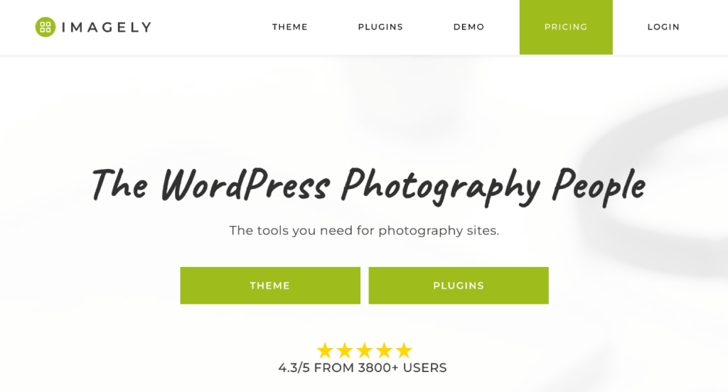
Imagely offers a WordPress theme tailored to photographers while the NextGEN Gallery plugin provides suite of features designed to help photographers grow their businesses. Using built-in eCommerce tools, you can sell photos directly through your website and even fulfill print orders automatically. The plugin’s client proofing tools and Lightroom integration streamline your workflow, allowing you to sync and update galleries without ever leaving Lightroom.
Build Your Site with Imagely Today →
Whether you’re just starting out or looking to scale your photography business, Imagely provides everything you need to create a professional website that looks great and converts visitors into clients.
Use these top photographer’s websites to inspire ideas for a portfolio that reflects your style and helps grow your brand. Whether you’re aiming for minimalism, bold visuals, or a cinematic feel, the key is letting your photography shine while providing visitors with an intuitive, seamless experience.
Learn More about Creating a Successful Photography Website
- How to Create a Photography Website: Ultimate Beginner’s Guide
- Photography Website Design: Expert Tips to Stand Out Online
- How to Sell Photography on Your Website
- How to Set Up a Client Gallery for Online Proofing in WordPress
- SEO Tips for Photographers: How to Boost Online Visibility
A well-designed photography webpage can make all the difference in showcasing your work and attracting clients. We hope these examples of the best photography websites helped you see how different styles, layouts, and design elements contribute to creating unique and memorable user experiences.
Don’t have NextGEN Gallery yet? Get started today!
For more photography tips and WordPress tutorials, check out our blog.

